AutoWriter AI
Eight Composition Habits That Fix the Phone Photos You Already Have

Your camera roll has two kinds of photos: the ones where the food looks flat, the subject sits tiny in the middle, and the horizon leans, and the ones where everything just works. The difference is almost always framing, not settings or gear.
This is a diagnostic checklist, not a style guide. Name the failure in your own photo, then apply the habit that fixes it. Settings and editing are covered in other posts on this blog and aren't repeated here.
Table of contents
- Start with the diagnosis, not the rule
- Habit one: turn on the grid and place your subject off-centre
- Habit two: get closer, and know when to zoom with your feet
- Habit three: build a foreground, middle ground and background
- Habit four: use lines, frames and empty space in ordinary places
- Habit five: match the frame to the screen it will be seen on
- Habit six: scan the edges before you press the shutter
- When to break each habit, and the one that matters most
Start with the diagnosis, not the rule
"My photos look boring" is almost never a phone problem. The camera is fine. What went wrong is usually decided in the second before you press the shutter: the subject is small, the background is busy, the horizon tilts. Those are framing problems, and no upgrade fixes them.
So before learning any rule, learn to diagnose. Two questions do most of the work:
- What is the subject? Say it out loud. "The coffee." "My friend." "The doorway." If you can't name one thing, the photo doesn't have one yet.
- What is competing with it? Look for the bright patch, the passing stranger, the bin, the tangle of cables. Anything that pulls the eye away from your answer to question one is the problem.
Every habit in this article maps to a specific failure you can probably find in your own camera roll right now: flat-looking food, a tiny subject, a cluttered edge. Match the symptom, apply the habit.
One thing to keep separate: these are decisions made before the shutter, not settings or editing. Those are worth learning, but framing comes first, and it costs nothing.
Habit one: turn on the grid and place your subject off-centre
Open your camera app and look for a setting called Grid, Gridlines or Composition. It is usually a toggle in the main settings menu or behind the gear icon at the top of the shooting screen. Switch it on once and it stays on. If you are already working through a list of phone camera settings worth changing, add this one first.
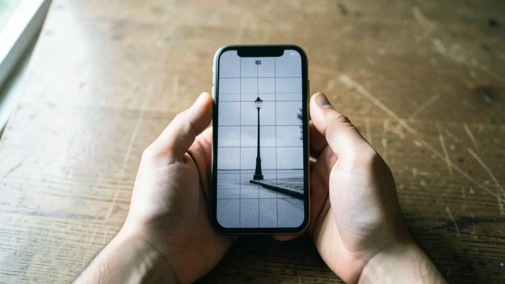
The overlay draws two vertical and two horizontal lines, dividing the frame into nine equal rectangles. Those lines sit roughly a third of the way in from each edge. Place a face on the upper horizontal line and the eyes land near it. Place a horizon on the lower line and the sky gets room to breathe. The subject stays the same size; what changes is how much space it has to sit in.
Then vary it deliberately:
- Left intersection: a person looking into the frame, with open space ahead of them.
- Right intersection: the same person facing the other way, or a subject with something to walk toward.
- Small in empty space: the subject dropped into a lower corner, surrounded by sky, wall or water. This is the fix for photos where everything feels crammed.
The caveat matters. A centred, symmetrical shot is a choice, not a slip: a doorway, a plate of food shot from directly above, a reflection. Centring says "this object, exactly." Thirds says "this scene."
And treat the rule as a convention, not a law of perception. It is a handy default because it stops you defaulting to dead centre every time. Your eye is the final judge.
Habit two: get closer, and know when to zoom with your feet
The most common flaw in a beginner's camera roll is a subject swimming in empty space. Before you change any setting, walk forward. Filling the frame with your subject removes distractions and makes the photo read instantly.
Pinch-zooming is not the same as walking closer. On most phones, zooming past the main lens is digital zoom: the camera crops the centre of the frame and enlarges it, so detail gets softer the further you push. A second lens (the telephoto) gives you real optical zoom, but if your phone lacks one, your feet do a better job.
Stepping back is sometimes right:
- Portraits. A close wide lens stretches whatever is nearest, so faces can look bulbous. Leave a little distance.
- Scenes where the surroundings are the point. A market stall or a mountain trail needs context, not a tight crop.
A quick check: if your subject fills less than roughly a third of the frame, ask whether that was deliberate. If not, move.
Habit three: build a foreground, middle ground and background
Flat food and flat landscapes usually have only one plane of interest. The subject sits at a single distance, so the frame reads as a sticker on a background. Depth comes from stacking layers: something close, the subject, something far.
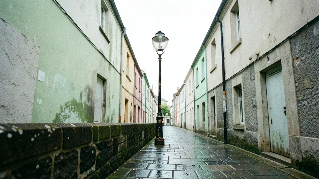
Put anything near the lens. A hand entering the frame, a cup edge, a doorway, foliage at the side. Because it's close, it renders large and slightly soft, and that's the point: it signals distance.
Angle does more than settings here. Crouch so the table edge leads to the plate. Raise the phone so the ground becomes a foreground band. Neither changes a single camera control.
Portrait mode is a separate tool. It blurs the background but doesn't create layers. A blurred single-plane photo still looks flat. Build the layers first, then decide whether blur helps.
One caveat: keep the foreground small. If it covers a third of the frame and adds nothing, it's clutter, not depth.
Habit four: use lines, frames and empty space in ordinary places
A landmark gives you lines and frames for free. A kitchen, a street corner and a hotel room don't, which is why photos taken there often look like evidence rather than pictures. Three devices fix that, and all three are already in the room.
Leading lines pull the eye toward your subject. Kerbs, railings, corridor walls, table edges and road markings all qualify. In a kitchen, shoot along the counter edge toward a bowl of fruit. On a street, stand so the pavement line runs to your friend's feet.
Natural frames put a border around the subject: doorways, windows, arches, gaps between branches. In a hotel room, shoot your subject through the bathroom doorway or past the edge of a curtain. On a street, use a shop doorway.
Negative space is deliberate emptiness. Leave a stretch of plain wall, sky or tablecloth so a small subject reads clearly instead of competing with clutter. A cup on a bare kitchen counter, a person at the end of an empty corridor.
All three work best when the frame is clean. If the lines point at a cluttered corner, move two steps and try again.
Habit five: match the frame to the screen it will be seen on
The shape of the frame is a composition choice, and it is usually made by accident. Your camera app opens in 4:3, most social feeds crop to vertical or square, and most screens are taller than they are wide.
| Format | What it does | Best for |
|---|---|---|
| 4:3 | Native sensor shape; most headroom and surroundings | Keeping options open; later cropping |
| 16:9 | Trims top and bottom; tighter, more cinematic | Wide scenes, landscapes, video |
| Square | Removes the orientation question; centres attention | Calm, graphic subjects; feed posts |
None is universally best. 4:3 captures the most information and crops well later, 16:9 suits spread-out interest across a wide scene, and square flatters single, centred subjects.
Shoot vertical when the photo will live on a phone screen, and landscape when the scene's interest runs sideways. Then think about the lens. The main wide lens is the safe default for people. The telephoto compresses space, pulling the background closer and flattering faces. The ultrawide is the wrong choice for people: it pushes everything in the frame further away and stretches the edges, so a face near the corner bends outward.
If you plan to crop heavily afterward, a little headroom helps. The editing apps for beginners guide covers the basics.
Habit six: scan the edges before you press the shutter
Most wasted phone shots fail at the edges, not the centre. Before you press the shutter, run your eye around the frame in this order:
- Top. Look for a lamp post, branch or sign growing out of a head, plus any empty space above it. Too much headroom makes the subject look small; clipping the top of the hair looks like a mistake. Aim for a small, even gap.
- Bottom. Check for bags, feet, chair legs and stray hands entering the frame. Cropping a person mid-thigh or mid-ankle reads as accidental, so either include the whole body or crop decisively.
- Left and right. Scan for half-cut people, elbows and doorframes. If someone is partly in shot, move a step sideways so they are either fully in or fully out.
- Horizon. Line it up with the grid if you have it on. A tilted horizon in a landscape or seascape looks like an error. Tilt only when you mean it, as a deliberate Dutch angle.
In a small, messy room, don't fight the clutter: move the subject towards a clean wall, shoot from a lower or higher angle, or step in close so the mess falls outside the frame.
When to break each habit, and the one that matters most
The habits are tools, not rules. Centred symmetry, extreme headroom, a deliberate tilt, a tight crop that cuts a face in half: each can be the right call when you choose it. The failure is only when it happens by accident.
If you keep just one habit, keep this: check the edges, then get closer. Between them they fix the failures people notice first in their own camera roll, the stray bin, the cut-off chin, the subject marooned in a sea of floor. Composition that is merely plain reads as fine. Clutter and tiny subjects read as mistakes.
Here is a useful exercise. Open ten old photos you nearly deleted. For each one, name the habit that would have saved it. You will start to see your own pattern, and that pattern is worth more than any list.
Next time you raise the phone, ask one question: what is wrong with this frame right now? Fix that.
Frequently asked questions
Does the rule of thirds still apply if I shoot in square format?
Yes. The grid divides whatever frame you have into thirds, so a square frame gets its own four intersection points. They sit closer to the centre than in a wide frame, so subjects placed there feel a little more anchored. Turn the grid on and check where the lines actually fall before you trust your instinct.
Should I shoot in 4:3 or 16:9 on my phone?
Shoot in 4:3 unless you know the photo will only ever be seen as a wide banner. On most phones 4:3 uses the full sensor, while 16:9 usually crops the top and bottom, so you lose pixels you cannot get back. You can always crop a 4:3 file to widescreen later.
Why do my portrait mode photos look wrong around the edges?
Portrait mode guesses depth from focus and software, and it often slips on hair, glasses, thin straps or gaps between an arm and the body. The result is a halo or a chunk of background that stays sharp. Busy backgrounds and low light make it worse, so simplify the scene behind your subject or skip the mode.
Is it better to crop later or compose carefully in the moment?
Compose in the moment, then crop as a small correction. Cropping throws away pixels and often reveals that the edges were never checked. A habit of framing well first keeps more resolution and trains your eye faster.
How do I stop people looking tiny in my travel photos?
Move closer and let the person fill a meaningful part of the frame, or use a foreground element to give them scale. If the landmark matters more than the face, place the person on a thirds line rather than dead centre. A tiny figure in the middle of a wide shot usually reads as an accident, not a choice.